Pip Hare Ocean Racing - Vendee Globe Campaign
Branding, Website Design & Squarespace Website Build
Pip Hare is a highly experienced professional Ocean Racer. She is currently working on qualification for the 2020 Vendee Globe, one of the toughest sailing races around. A single-handed race around the world. No help. No stops. No turning back.
I was approached by her Campaign manager to work on the branding design, website design and website build for her campaign where she is hoping to raise over £1million to help fund the training, boat and race. As one of only 5 women in history to compete in the race, and less than 10 British skippers, it was an honour to help her make it happen.
The logo was created with a hand drawn custom script, giving Pip a unique and own able look. The goal was to create a mark that was immediately recognisable as a strong, experienced, British sailing brand. Balancing the right mix or strength and feminine qualities that reflected Pip’s driven personality.
Hand drawing concepts, playing with styles, dynamics and elegant strokes.
Sketch after Sketch, refining aspects and balancing perfection with unique elements of style.
For the website function, I hand illustrated a map of the world which will be used to add pins to for locations which have been reviewed.
“Thank you so much. It looks fantastic. Exactly what I was after.”
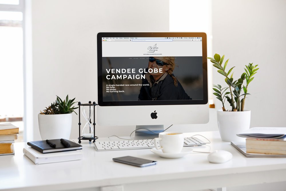
The website was created as a 1 page scrolling site with menu links to each section, allowing users to easily discover Pip’s story on desktops and mobile. The site was designed and built in squarespace to allow for easy editing by Pip and her marketing team in the future with plenty of features to develop. We also built more in-depth pages to help tell her story online as well as building a seperate business syndicate section where sponsors of her campaign could access resources.
The website was created to be SEO friendly and help to build her brand as she working on raising money with more sponsors and growing her marketing around her campaign.
Check out the site at: PipHareOceanRacing.com
Logo embroiled Jacket to keep Pip warm whilst training through the winter and cold mornings.
SIMILAR PROJECTS
I was approached by Paper Moose to work with their Art Director Reese Geronimo on the branding for an exciting new clothing label called 'Murray & Smyth'. The streetwear company is inspired by youth subcultures and vintage workwear brands, particularly when clothing was union made. The task was to create a logo which was entirely unique, sturdy and timeless, taking inspiration from these youth subcultures.


